
Updated with companies and businesses form 2018.

Some notes:
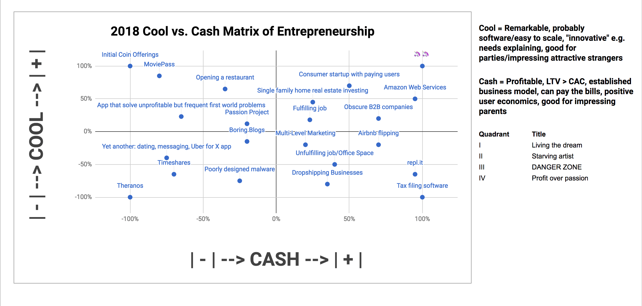
1. Why did I make this?
Upon finishing my two year fellowship with Venture for America, I wanted something that could summarize the macro picture of my individual learnings. Individually, I could identify the difference between creating vs. capturing value, product innovation vs. marketing innovation. But those things didn’t matter very much on a intuitive level of “what does that jargon mean?”
The cool cash spectrum helps me evaluate opportunities, and also to develop a framework for patterns in my thinking.
2. Why is this useful?
The core thesis statement I reinforced in myself with this chart was this: for my skill level as an entrepreneur, it was drastically more preferable to move from Quadrant IV (“profit over passion”) into Quadrant I (“living the dream”) than moving from Quadrant II (“starving artist”) into Quadrant I.
In layman’s terms, it’s much easier to buy cool than trading cool for cash.
The vast majority of my side projects have been cool over cash*
Corpus:
- (2011) Augmentide: Internet literacy programs for the elderly,
- (2013) An RSS reader to replace Google Reader
- (2014) Noggin: communication app for users with neurodegenerative diseases
- (2015) Epigraph: social network helping introverts make friends
- (2017) MFL App: learn foreign languages by studying song lyrics in foreign languages
3. Disclaimers
Normal disclaimers that, yes, there are nerds who think obscure businesses are cool, and companies that make unfathomable amounts in equity before a giant exit (e.g. WhatsApp’s $1 subscription fee before the $19 billion acquisition by Facebook.) However, those are generally the exceptions to the rule.
More commentary from yours truly coming soon.